 Mount Vernon
 Why Color Choice on Fiber Cement Isn't Just a Paint Decision
Picking a siding color sounds like the fun part of a project — until you realize the color is only half the decision. The other half is how that color is applied and how it's going to hold up on a house three blocks from Skagit Bay, where salt-tinged air, driving winter rain, and months of low, damp light are just part of the deal. On wood, vinyl, or primed fiber cement, color is a surface-level choice. On James Hardie siding finished with ColorPlus Technology, color is baked into the manufacturing process itself, which changes how you should think about picking one.
This guide walks through how Hardie's factory-finish system works, how to match a color to Mount Vernon's climate and light, and what actually affects the cost and durability of a colored fiber cement project — no hype, just the mechanics of the product.
ColorPlus Technology: What Makes It Different
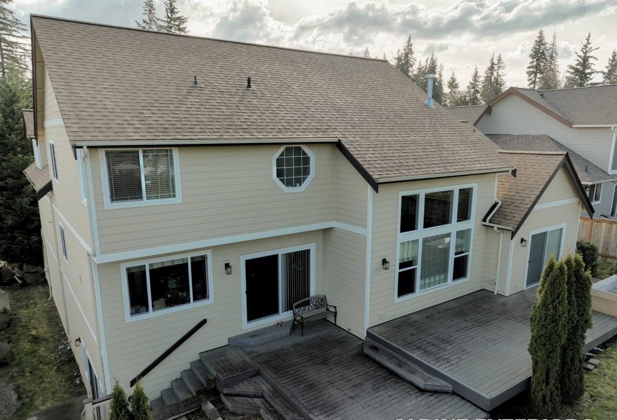
Most fiber cement siding, and almost all wood and LP products, get their color from field-applied paint — a crew on a ladder rolling or spraying color onto the house after installation. James Hardie's ColorPlus finish is applied at the factory instead, using a baked-on, multi-coat process before the boards ever reach the job site.
Why the Factory Step Matters
A factory-cured finish bonds more evenly and consistently than a field-applied coat, because it's cured under controlled conditions rather than whatever the weather happens to be doing that week. In a place like Mount Vernon, where a dry install window can be tight between fall and spring rain systems, that matters. A field-painted product depends on the painter catching the right temperature and humidity window on-site. A ColorPlus board already has its finish locked in before it's nailed up.
What It Means for Upkeep
ColorPlus siding isn't maintenance-free, but it's built to go a long stretch — commonly cited in Hardie's own product literature as many years — before repainting becomes a serious consideration, versus the shorter repaint cycles typical of field-finished wood or primed siding. That's a real factor in a climate where repainting means scheduling around a narrow dry season.
The Color Palette: What's Actually Available
James Hardie offers ColorPlus colors through a curated palette rather than an unlimited custom-match system. That's intentional — the colors are engineered and tested as part of the finish system, not mixed to order like a paint store swatch. The palette generally includes:
- Neutral and warm whites, popular for a clean, classic look on Craftsman and farmhouse-style homes common around Skagit County
- Grays ranging from light "greige" tones to deep charcoal, which read well against the muted gray-green backdrop of the Skagit Valley
- Deeper blues and greens that hold up visually against evergreen landscaping and don't wash out under overcast skies
- Warm earth tones — tans, browns, and deep reds — for a more traditional or rustic exterior
- A handful of true dark statement colors, including near-black options, for modern or high-contrast designs
Primed Hardie boards, meant for field painting, are also available for homeowners who want a fully custom color outside the ColorPlus range — but that route sacrifices the factory-cured durability advantage and shifts the color job back to whatever paint and crew you hire.
Matching a Color to Mount Vernon's Climate
Color isn't purely aesthetic here — the local climate genuinely influences which shades perform and look their best over time.
Moss and Algae Season
Skagit County's long, wet, mild season is exactly the kind of environment moss and algae like. No siding color is immune, but very light, flat colors tend to show green or black streaking more visibly than mid-tone or textured finishes, simply because the contrast is higher. Darker colors can mask early growth longer, but they also absorb more heat in the rare sunny stretch, which can affect trim and caulk over time. Neither extreme is "wrong" — it's a trade-off worth discussing before you commit.
Driving Rain and Water Staining
Wind-driven rain off the Sound and the Skagit River delta tends to hit west- and south-facing walls hardest. On those elevations, very dark colors can show water spotting and mineral streaking more obviously than mid-tone grays or warm neutrals, which tend to hide it better. This is a small detail, but it's the kind of thing worth thinking through elevation by elevation, not just from a paint chip in your hand.
Salt Air
Properties nearer the water deal with a fine layer of salt-laden moisture that can dull or chalk lesser finishes faster than inland homes. ColorPlus's baked-on, multi-layer finish is built to resist fading and chalking better than a standard field paint job, which is one of the practical reasons this finish system holds up well in coastal-influenced areas like ours, not just in theory but in day-to-day exposure.
Product Lines and Where Color Fits In
James Hardie builds region-specific product lines, and in the Pacific Northwest that means the HZ5 engineered line, formulated for climates with significant moisture exposure. Color and product engineering are separate systems — you're not sacrificing color options by choosing the climate-appropriate line — but it's worth understanding that the board underneath your chosen color is also selected to match Skagit County's rain and moisture profile, not a generic national spec.
Lap Siding, Panel, and Shingle Options
The same ColorPlus color is generally available across Hardie's different board styles — traditional lap siding, vertical panel, and shingle-style — which lets a color scheme carry consistently across a primary field, gable accents, and trim without hunting for a separate match.
Trim, Accent, and Multi-Color Combinations
Most of the best-looking Hardie projects in this area aren't single-color — they pair a primary field color with a contrasting trim color and sometimes a third accent on shakes or a focal gable. A few practical notes:
- Trim in a crisp white or light neutral tends to read cleanly against both light and dark field colors and holds up visually in our low, flat winter light.
- Darker accent colors on a small feature — a gable, a bay window surround, a front entry — read as intentional design rather than overwhelming the whole house.
- Keep undertones consistent: a field color with cool gray undertones paired with warm-toned trim can look mismatched once the house is up, even if the two swatches looked fine side by side.
It's worth viewing large color samples on the actual house, in actual Mount Vernon daylight, rather than trusting a small chip or a screen — our cloud cover changes how a color reads more than people expect.
What Actually Affects Cost
Color choice itself has a modest effect on project cost, but a few related factors move the number more than the color swatch does:
| Factor | Why It Matters |
|---|---|
| ColorPlus vs. primed-for-paint | ColorPlus carries a modest material upcharge over primed board but eliminates the cost and scheduling of a separate paint job |
| Custom/primed color | Going outside the ColorPlus palette means factoring in a professional-grade paint job and its own maintenance cycle later |
| Multi-color trim scheme | More color changes mean more transitions, more cutting precision, and more coordination during install |
| Board profile and width | Deeper shadow-line profiles and narrower reveals use more material per square foot regardless of color |
| Touch-up and caulk matching | ColorPlus-matched caulk and touch-up kits keep seams and nail heads invisible; skipping this step shows up later |
Caring for a Colored Fiber Cement Exterior
ColorPlus finishes are low-maintenance, not no-maintenance. A yearly rinse-down helps keep moss and organic growth from getting a foothold, especially on north-facing walls that stay shaded and damp longer through our fall and winter. Touch-up paint matched to the specific ColorPlus formula is available for nicks or repairs, which is one advantage of sticking with the factory palette rather than a custom-mixed color that a future touch-up job would need to re-match from scratch.
A Practical Checklist Before You Choose
- View large-format color samples outdoors, on the house, across a full day — not indoors or on a phone screen
- Check how the color reads on both the shaded and sun-exposed elevations of the home
- Decide on trim and accent colors at the same time as the field color, not afterward
- Confirm whether you're choosing a ColorPlus factory finish or a primed board that will need field painting
- Ask what touch-up and caulk-matching process comes with your specific color choice
- Consider how the color will read against existing rooflines, stonework, or landscaping already on the property
Getting It Right the First Time
Color is one of the most visible decisions in a siding project, and it's also one of the hardest to undo once boards are cut and nailed. Taking the time to view real samples in Mount Vernon's actual light, understand the difference between ColorPlus and primed options, and think through how a color will age in our specific moss-and-rain climate pays off for years afterward.
If you're weighing colors or product lines for an upcoming siding project, we're happy to walk through samples on your own home and put together a free, no-pressure estimate — no obligation, just straight answers.